Code
library(TSA)Based on Chapter 3, Cryer and Chan
Time series are often decomposed into components: deterministic and stochastic. The decomposition is additive: \[ Y_t = \mu_t + X_t \] where \(Y_t\) is the observed value at time \(t\), \(\mu_t\) is the deterministic component, and \(X_t\) is the stochastic component.
library(TSA)We are going to fit a linear trend to a random walk
# Set seed for reproducibility
set.seed(439)
# Generate a random walk
rw <- cumsum(rnorm(60))
# Fit a linear trend to the random walk
model1 <- lm(rw ~ time(rw))
# Print the summary of the model
summary(model1)
Call:
lm(formula = rw ~ time(rw))

Residuals:
   Min     1Q Median     3Q    Max
-5.101 -2.414  1.064  1.970  4.063

Coefficients:
            Estimate Std. Error t value Pr(>|t|)
(Intercept) -0.50344    0.70526  -0.714    0.478
time(rw)     0.14957    0.02011   7.438 5.37e-10 ***
---
Signif. codes:  0 '***' 0.001 '**' 0.01 '*' 0.05 '.' 0.1 ' ' 1

Residual standard error: 2.697 on 58 degrees of freedom
Multiple R-squared:  0.4882,    Adjusted R-squared:  0.4794
F-statistic: 55.33 on 1 and 58 DF, p-value: 5.371e-10# Plot the random walk
plot(rw,
type='o',
ylab='y',
xlab='Time',
main='Random Walk',
col='blue',
pch=20,
cex=0.5)
abline(model1) # add the fitted least squares line from model1
legend('topleft',
legend=c('Fitted Trend Line','Random Walk'),
col=c('black','blue'),
lty=1)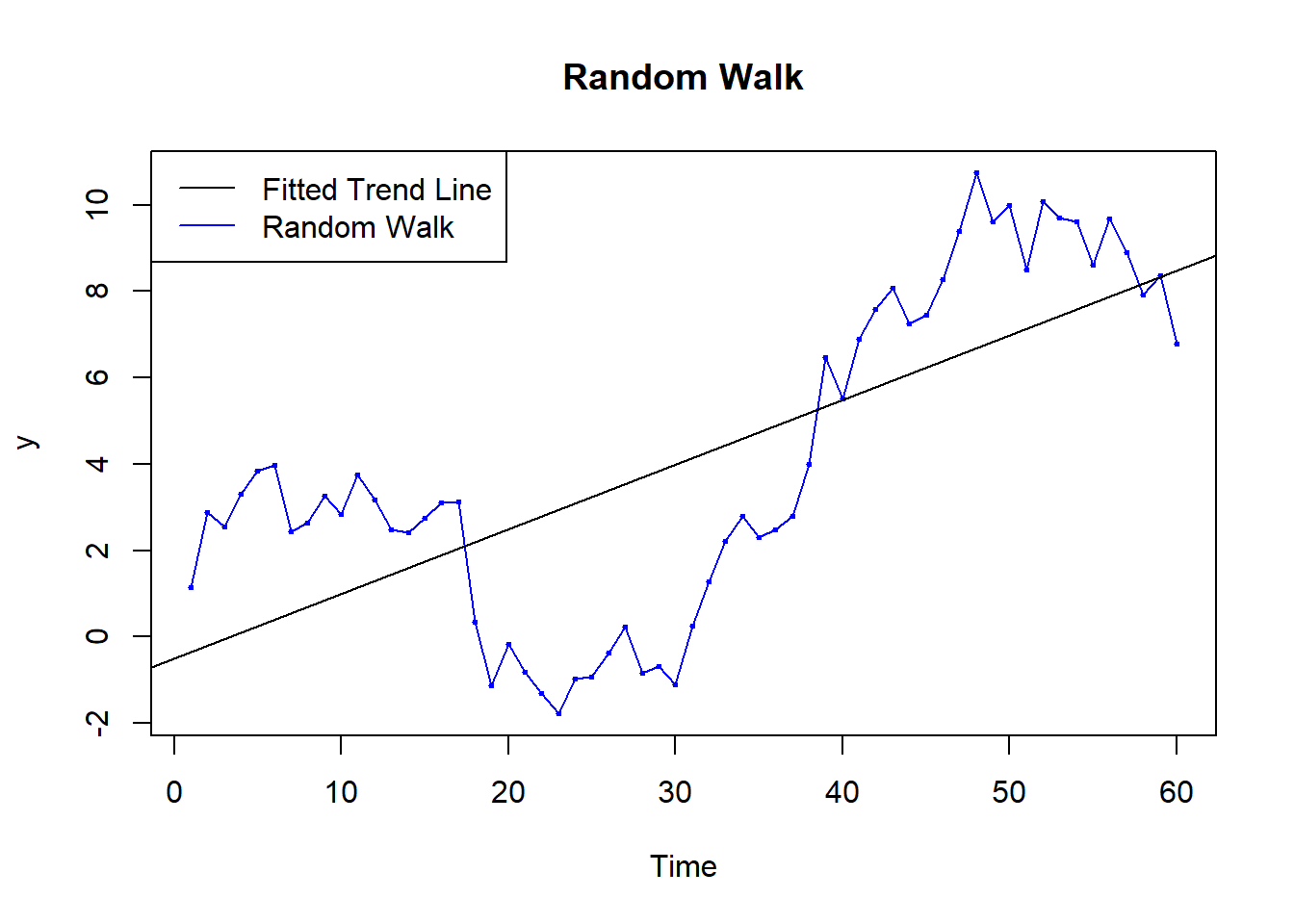
# Load the US population data
data("uspop")
# Fit a quadratic trend to the US population data
model.pop <- lm(uspop~time(uspop)+I(time(uspop)^2))
# Extract the coefficients
coef <- model.pop$coefficients
# Print the summary of the model
summary(model.pop)
Call:
lm(formula = uspop ~ time(uspop) + I(time(uspop)^2))

Residuals:
    Min      1Q  Median      3Q     Max
-6.5997 -0.7105  0.2669  1.4065  3.9879

Coefficients:
                   Estimate Std. Error t value Pr(>|t|)
(Intercept)       2.045e+04  8.431e+02   24.25 4.81e-14 ***
time(uspop)      -2.278e+01  8.974e-01  -25.38 2.36e-14 ***
I(time(uspop)^2)  6.345e-03  2.387e-04   26.58 1.14e-14 ***
---
Signif. codes:  0 '***' 0.001 '**' 0.01 '*' 0.05 '.' 0.1 ' ' 1

Residual standard error: 2.78 on 16 degrees of freedom
Multiple R-squared:  0.9983,    Adjusted R-squared:  0.9981
F-statistic: 4645 on 2 and 16 DF, p-value: < 2.2e-16# Plot the US population data
plot(y=uspop,
x=as.vector(time(uspop)),
xlab='Time',
ylab='US population 1790-1970',
type='o',
col = 'blue',
main='US Population 1790-1970')
# Add the fitted quadratic trend line
lines(x=as.vector(time(uspop)),
y=coef[1]+coef[2]*as.vector(time(uspop))+coef[3]*as.vector(time(uspop))^2,
col='red')
# Add the legend
legend('topleft',
legend=c('Fitted Quadratic Trend Line','US Population'),
col=c('red','blue'),
lty=1)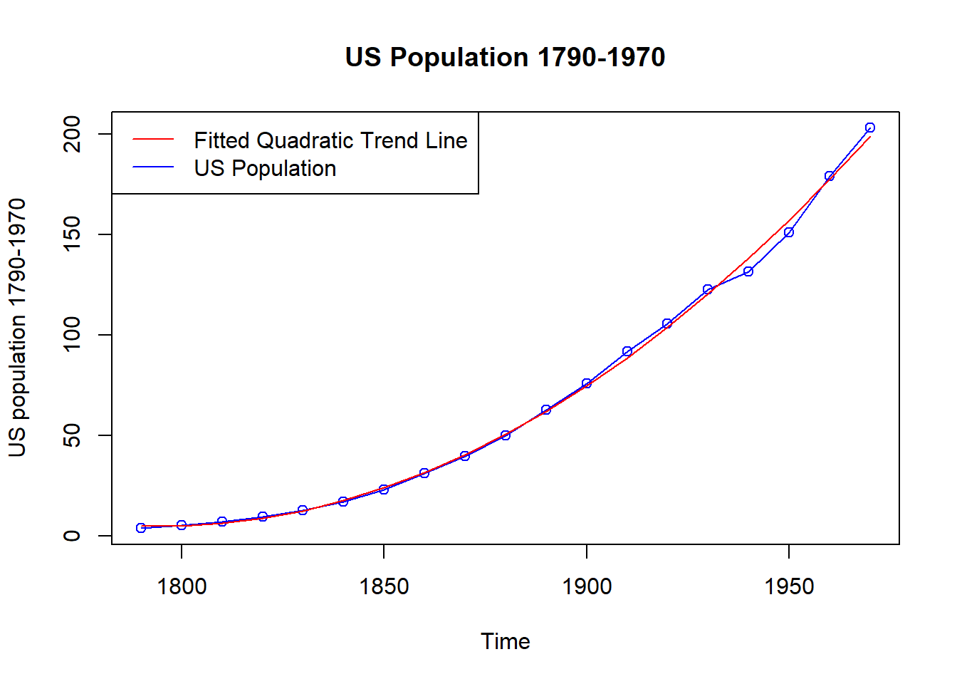
\[ Y_t = \mu_{t} + X_t \] Here, \(\mu_{t}\) is the seasonal mean and \(X_t\) is the seasonal deviation.
\[ \mu_1 = \text{mean for January}, \mu_2 = \text{mean for February}, \ldots, \mu_{12} = \text{mean for December} \]
Dataset: Average monthly temperatures, Dubuque, Iowa.
data("tempdub")
plot(tempdub,
     ylab='Temperature',
     type='o',
     xlab='Time',
     main='Average Monthly Temperatures, Dubuque, Iowa')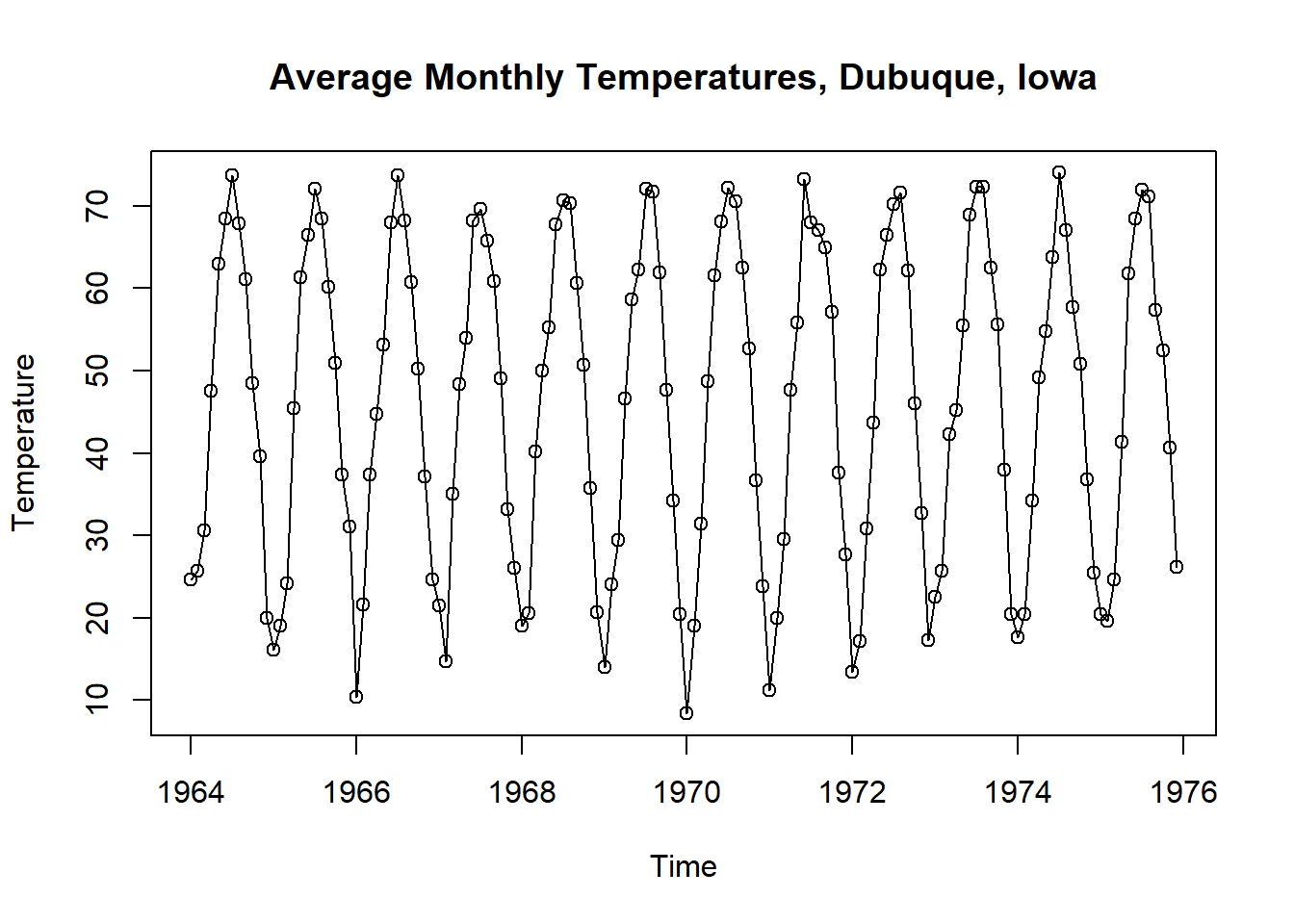
month. <- season(tempdub) # period added to improve table display
model2 <- lm(tempdub ~ month. + 0) # 0 removes the intercept term
#model2 <- lm(tempdub ~ month. - 1) # -1 also removes the intercept term
summary(model2)
Call:
lm(formula = tempdub ~ month. + 0)

Residuals:
    Min      1Q  Median      3Q     Max
-8.2750 -2.2479  0.1125  1.8896  9.8250

Coefficients:
                Estimate Std. Error t value Pr(>|t|)
month.January     16.608      0.987   16.83   <2e-16 ***
month.February    20.650      0.987   20.92   <2e-16 ***
month.March       32.475      0.987   32.90   <2e-16 ***
month.April       46.525      0.987   47.14   <2e-16 ***
month.May         58.092      0.987   58.86   <2e-16 ***
month.June        67.500      0.987   68.39   <2e-16 ***
month.July        71.717      0.987   72.66   <2e-16 ***
month.August      69.333      0.987   70.25   <2e-16 ***
month.September   61.025      0.987   61.83   <2e-16 ***
month.October     50.975      0.987   51.65   <2e-16 ***
month.November    36.650      0.987   37.13   <2e-16 ***
month.December    23.642      0.987   23.95   <2e-16 ***
---
Signif. codes:  0 '***' 0.001 '**' 0.01 '*' 0.05 '.' 0.1 ' ' 1

Residual standard error: 3.419 on 132 degrees of freedom
Multiple R-squared:  0.9957,    Adjusted R-squared:  0.9953
F-statistic: 2569 on 12 and 132 DF, p-value: < 2.2e-16plot(tempdub,
ylab='Temperature',
type='o',
xlab='Time',
main='Average Monthly Temperatures, Dubuque, Iowa')
points(time(tempdub),fitted(model2), col = "red", type='o')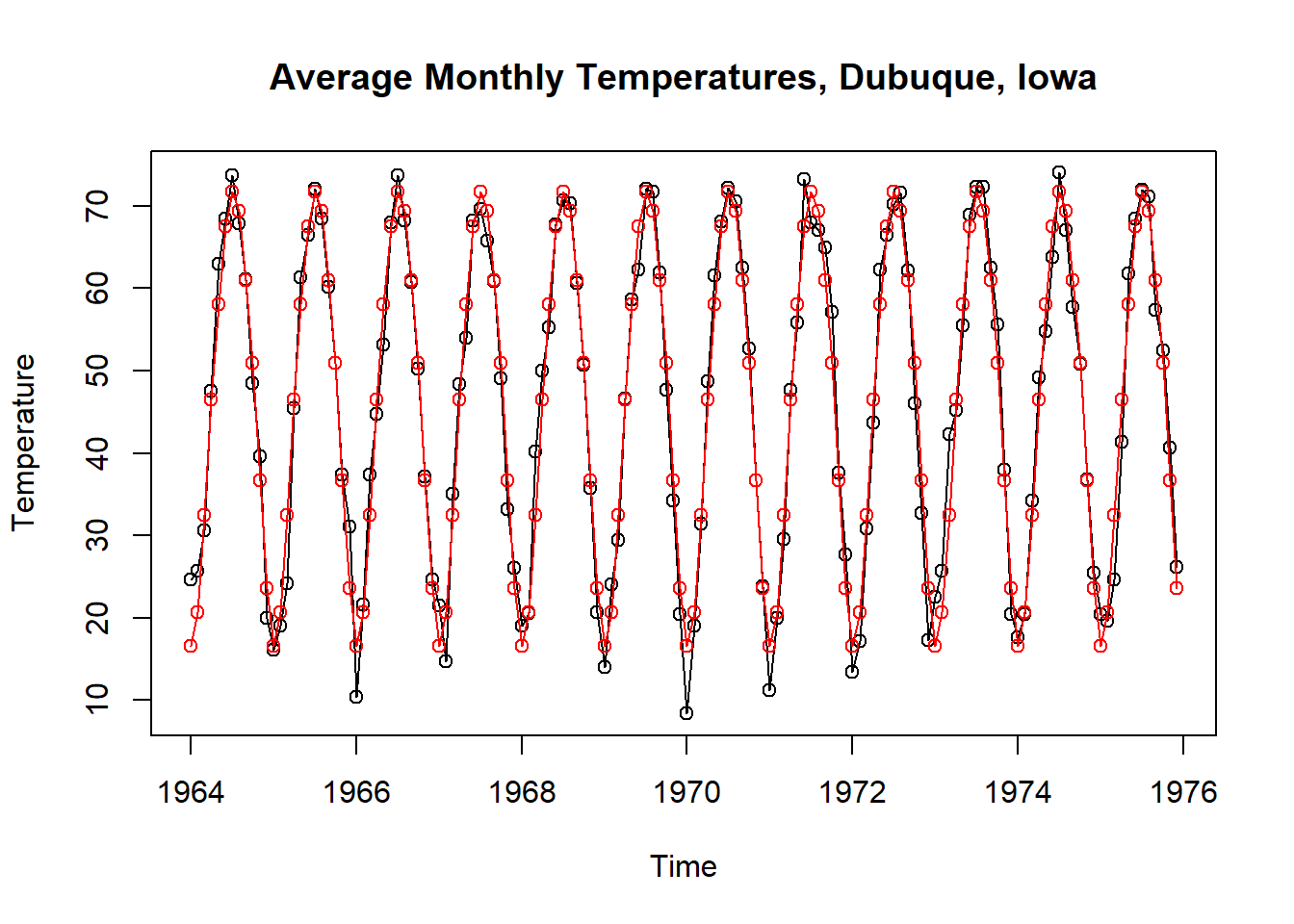
Above, we have \[ \mu_{t} = \beta_{t} \]
model3 <- lm(tempdub ~ month.) # January is dropped automatically
summary(model3)
Call:
lm(formula = tempdub ~ month.)

Residuals:
    Min      1Q  Median      3Q     Max
-8.2750 -2.2479  0.1125  1.8896  9.8250

Coefficients:
                Estimate Std. Error t value Pr(>|t|)
(Intercept)       16.608      0.987  16.828  < 2e-16 ***
month.February     4.042      1.396   2.896  0.00443 **
month.March       15.867      1.396  11.368  < 2e-16 ***
month.April       29.917      1.396  21.434  < 2e-16 ***
month.May         41.483      1.396  29.721  < 2e-16 ***
month.June        50.892      1.396  36.461  < 2e-16 ***
month.July        55.108      1.396  39.482  < 2e-16 ***
month.August      52.725      1.396  37.775  < 2e-16 ***
month.September   44.417      1.396  31.822  < 2e-16 ***
month.October     34.367      1.396  24.622  < 2e-16 ***
month.November    20.042      1.396  14.359  < 2e-16 ***
month.December     7.033      1.396   5.039 1.51e-06 ***
---
Signif. codes:  0 '***' 0.001 '**' 0.01 '*' 0.05 '.' 0.1 ' ' 1

Residual standard error: 3.419 on 132 degrees of freedom
Multiple R-squared:  0.9712,    Adjusted R-squared:  0.9688
F-statistic: 405.1 on 11 and 132 DF,  p-value: < 2.2e-16
When we fit with the intercept term, we have \[ \mu_1 = \beta_0,\qquad \mu_{t} = \beta_0 + \beta_{t}, \quad t=2,3,\ldots,12 \]
# Fitting a cosine trend model
har. <- harmonic(tempdub,1)
model4 <- lm(tempdub ~ har.)
summary(model4)
Call:
lm(formula = tempdub ~ har.)

Residuals:
     Min       1Q   Median       3Q      Max
-11.1580  -2.2756  -0.1457   2.3754  11.2671

Coefficients:
                Estimate Std. Error t value Pr(>|t|)
(Intercept)      46.2660     0.3088 149.816  < 2e-16 ***
har.cos(2*pi*t) -26.7079     0.4367 -61.154  < 2e-16 ***
har.sin(2*pi*t)  -2.1697     0.4367  -4.968 1.93e-06 ***
---
Signif. codes:  0 '***' 0.001 '**' 0.01 '*' 0.05 '.' 0.1 ' ' 1

Residual standard error: 3.706 on 141 degrees of freedom
Multiple R-squared:  0.9639,    Adjusted R-squared:  0.9634
F-statistic: 1882 on 2 and 141 DF, p-value: < 2.2e-16# Plot the data and the fitted cosine trend
plot(tempdub,
ylab='Temperature',
type='o',
xlab='Time',
main='Average Monthly Temperatures, Dubuque, Iowa')
points(time(tempdub),fitted(model4),col='red', type='o')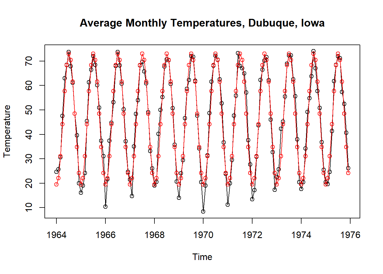
After estimating the trend by \(\hat\mu_t\), we can predict the unobserved values of the stochastic component \(X_t\) by \(\hat{X}_t = Y_t - \hat{\mu}_t\).
plot(y=rstudent(model2),
     x=as.vector(time(tempdub)),
     xlab='Time',
     ylab='Standardized Residuals',
     type='o',
     main = 'Residuals from Seasonal Means Model w/o Intercept')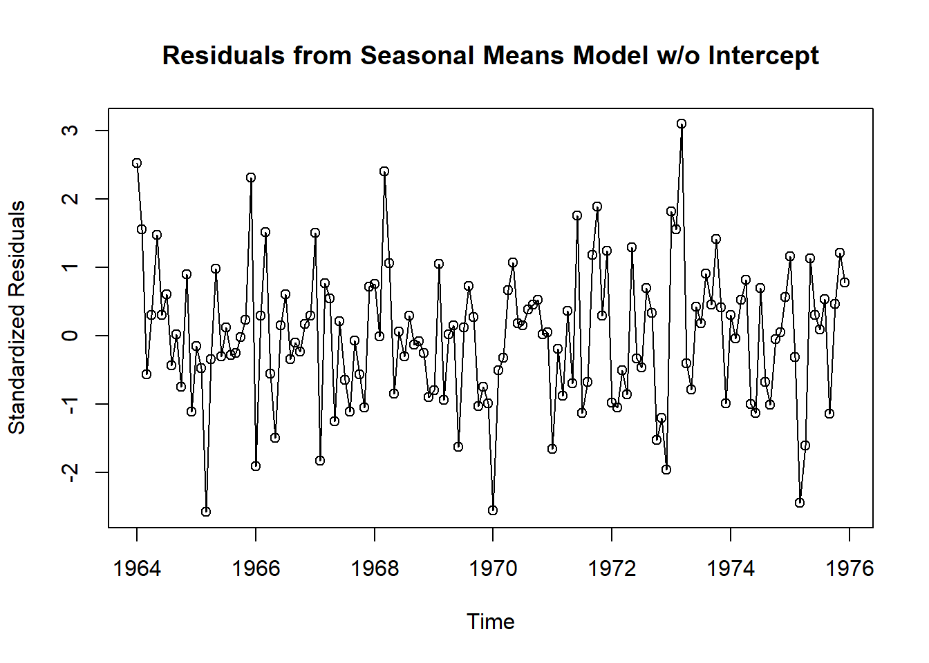
plot(y=rstudent(model3),
     x=as.vector(time(tempdub)),
     xlab='Time',
     ylab='Standardized Residuals',
     type='l',
     main = 'Residuals from Seasonal Means Model')

points(y=rstudent(model3),
       x=as.vector(time(tempdub)),
       pch=as.vector(season(tempdub)),
       col = 1:4)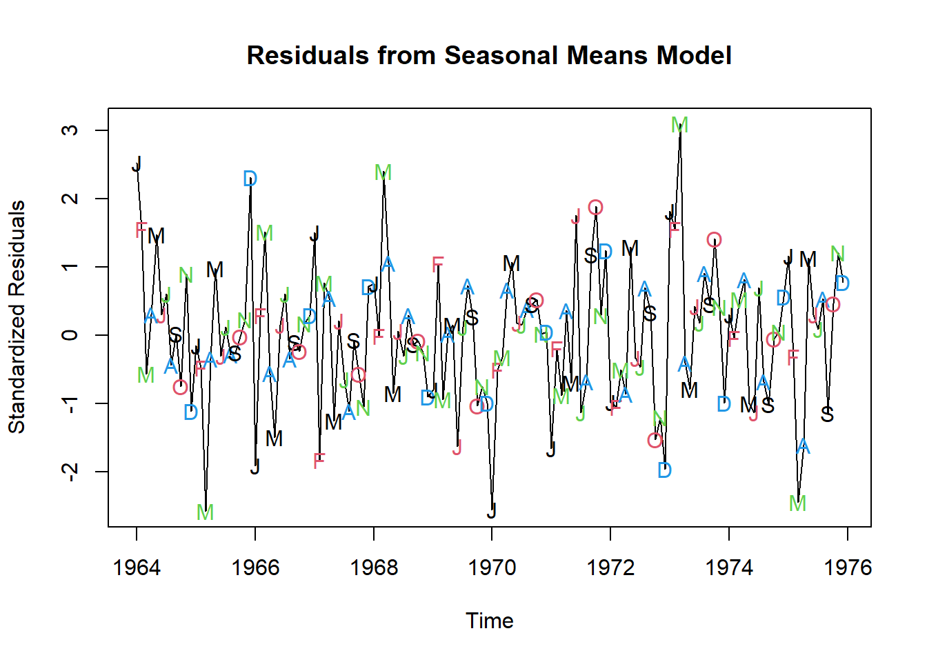
plot(y=rstudent(model3),
     x=as.vector(fitted(model3)),
     xlab='Fitted Trend Values',
     ylab='Standardized Residuals',type='n',
     main='Residuals vs Fitted Values from Seasonal Means Model')
     points(y=rstudent(model3),
     x=as.vector(fitted(model3)),
     pch=as.vector(season(tempdub)),
     col = 1:4)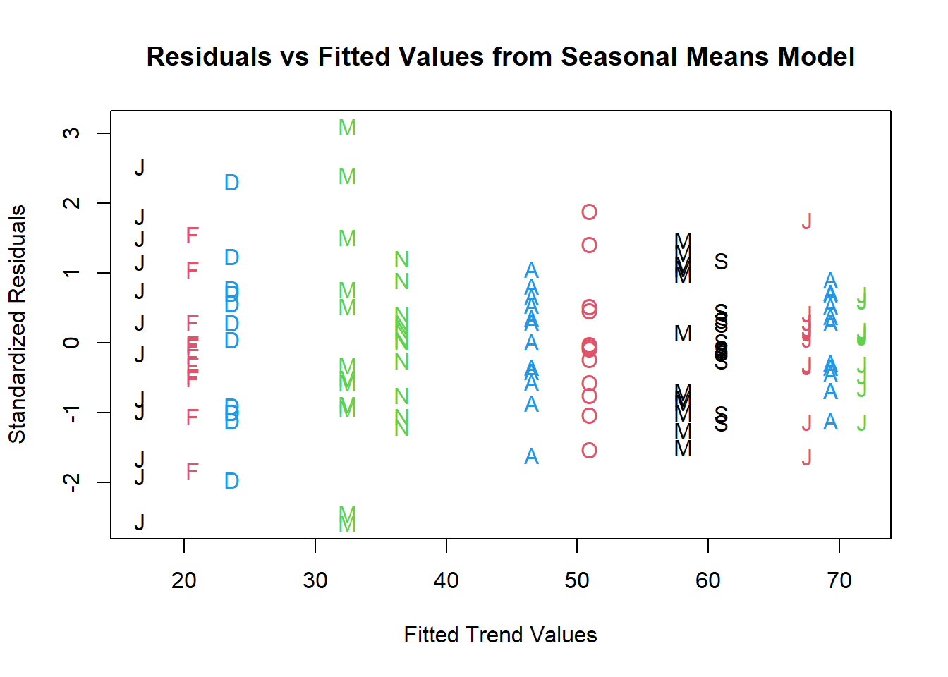
plot(y=rstudent(model4),
     x=as.vector(fitted(model4)),
     xlab='Fitted Trend Values',
     ylab='Standardized Residuals',type='n',
     main='Residuals vs Fitted Values from Cosine Trends')
     points(y=rstudent(model4),
     x=as.vector(fitted(model4)),
     pch=as.vector(season(tempdub)),
     col = 1:4)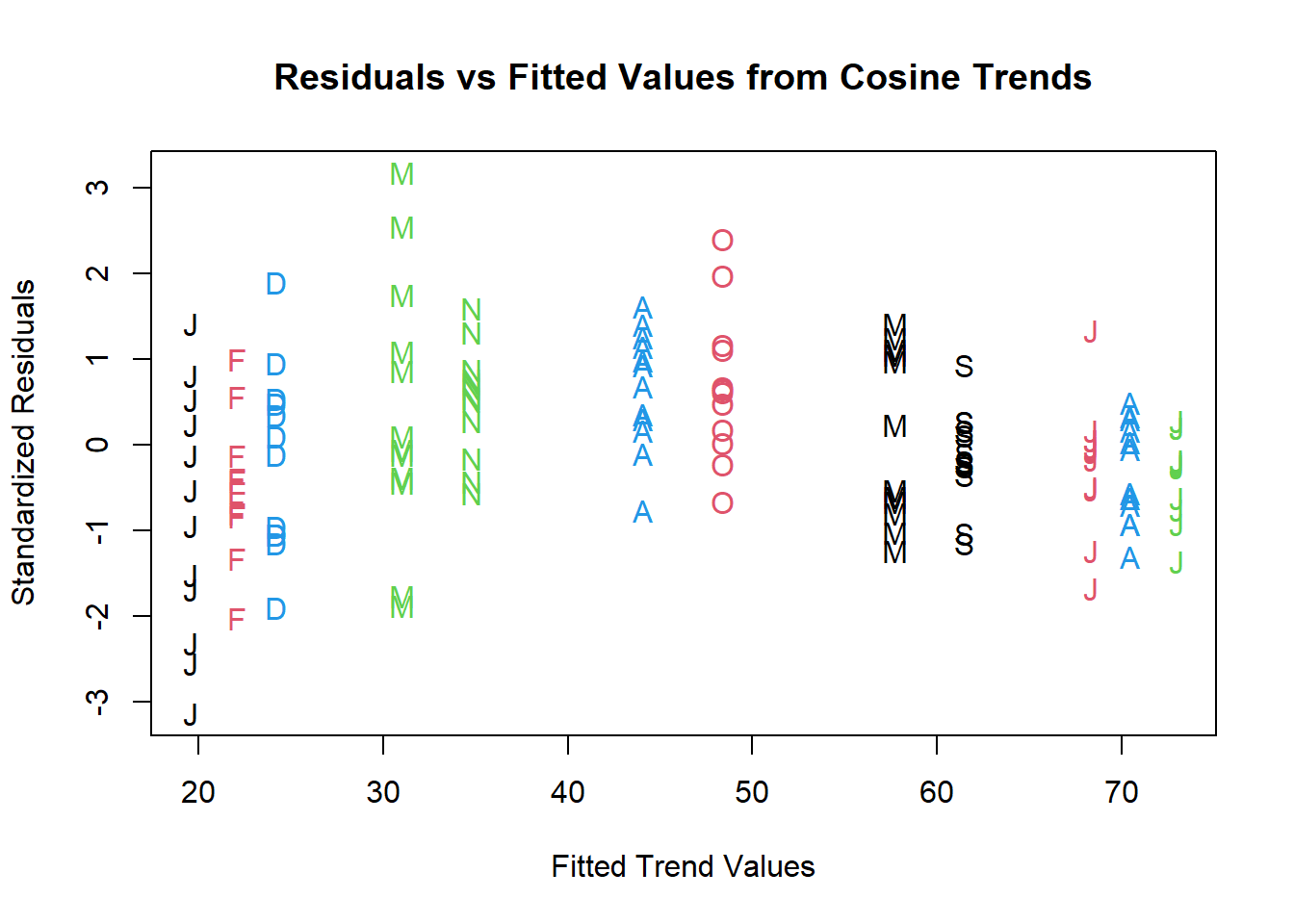
Histogram is a very rough tool to assess normality
hist(rstudent(model3),
     xlab='Standardized Residuals',
     main='Histogram of Residuals from Seasonal Means Model')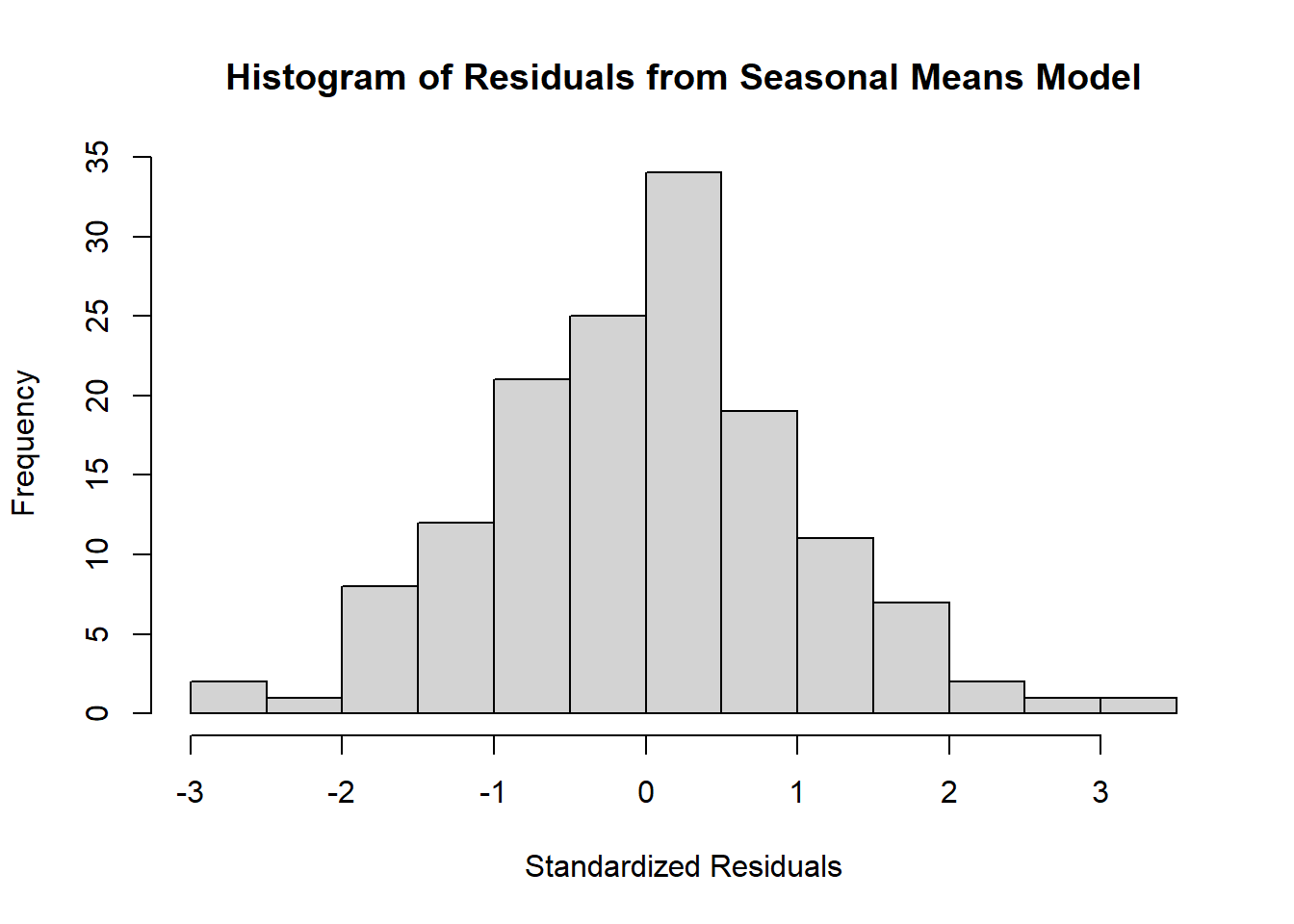
QQ-plot is a much better tool:
# Plotting the QQ-plot
qqnorm(rstudent(model3),
       main='QQ-plot of Residuals from Seasonal Means Model')
qqline(rstudent(model3),col='red',lty=2)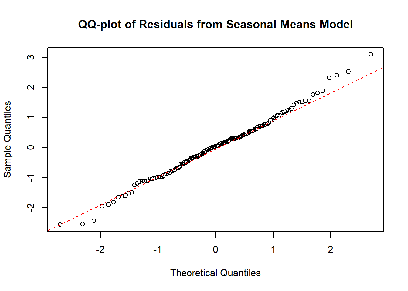
QQ-plot is an excellent visual diagnostic. We can use a Shapiro-Wilk test to assess normality:
# Shapiro-Wilk test for normality. H0: data is normally distributed
shapiro.test(rstudent(model3))
    Shapiro-Wilk normality test

data:  rstudent(model3)
W = 0.9929, p-value = 0.6954
Test for independence: runs test
# Runs test for independence. H0: data is independent
runs(rstudent(model3))
$pvalue
[1] 0.216
$observed.runs
[1] 65
$expected.runs
[1] 72.875
$n1
[1] 69
$n2
[1] 75
$k
[1] 0Another tool for assessing dependency is a sample ACF.
Sample autocorrelation function, for \(k=1, 2, 3,\ldots\):
\[ r_k=\dfrac{\sum_{t=k+1}^n(Y_t-\bar{Y})(Y_{t-k}-\bar{Y})}{\sum_{t=1}^n(Y_t-\bar{Y})^2} \]
acf(rstudent(model3),
    main='ACF of Residuals from Seasonal Means Model')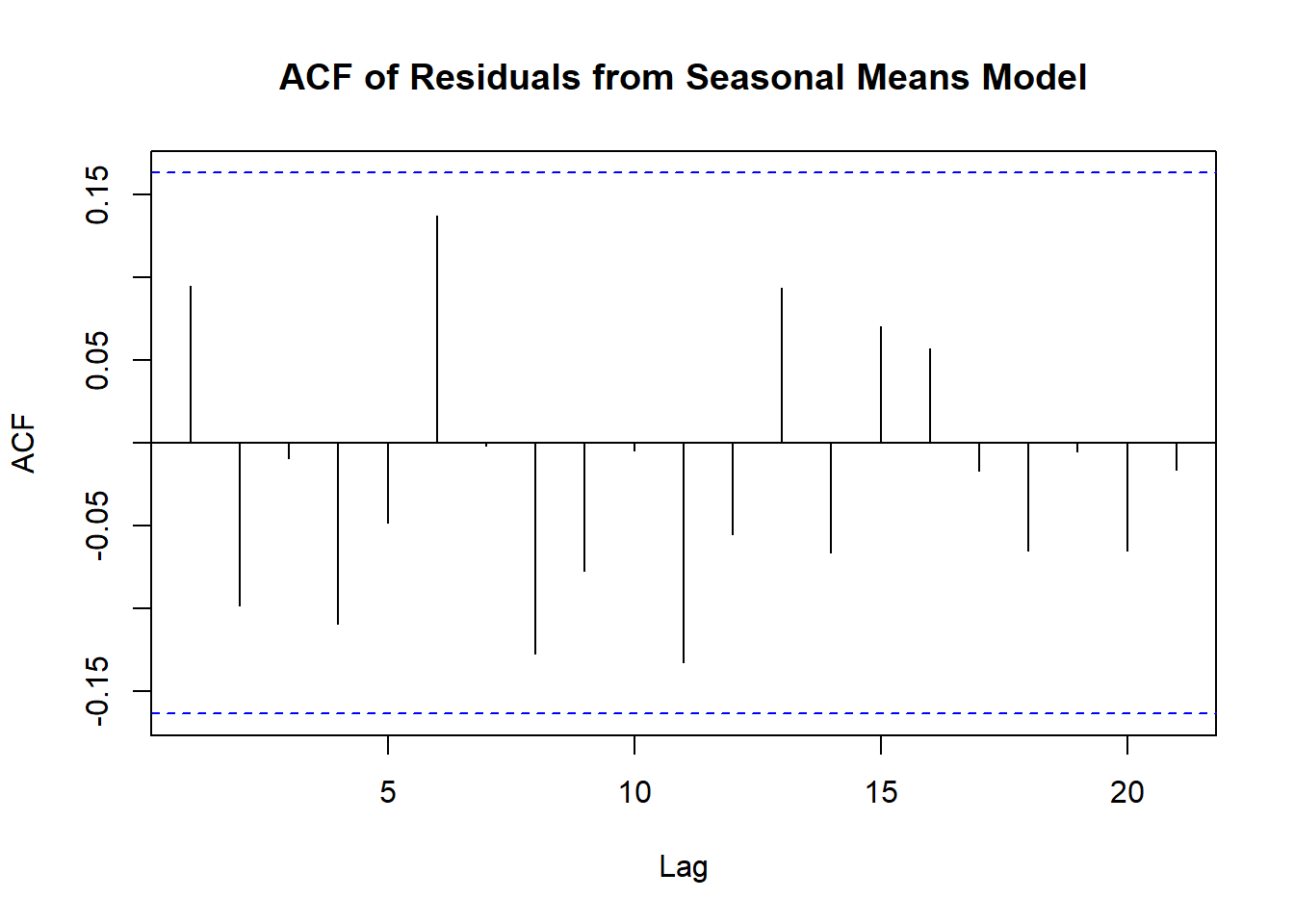
plot(y=rstudent(model1),
     x=as.vector(time(rw)),
     ylab='Standardized Residuals',
     xlab='Time',
     type='o',
     main='Residuals from Straight Line Fit to Random Walk')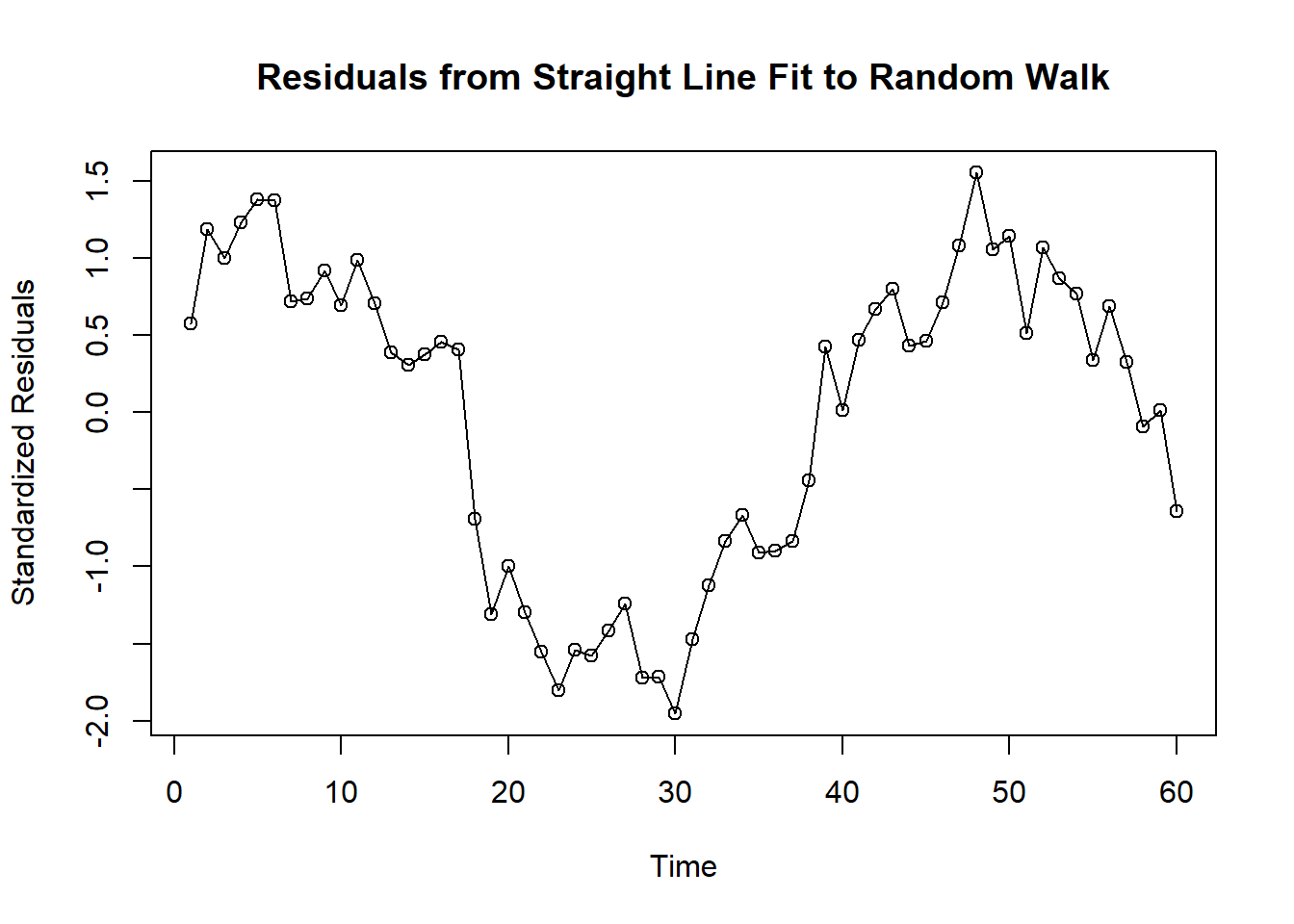
Residuals versus Fitted Values from Straight Line Fit: larger values of residuals correspond to larger fitted values.
plot(y=rstudent(model1),
     x=fitted(model1),
     ylab='Standardized Residuals',
     xlab='Fitted Trend Line Values',
     type='p')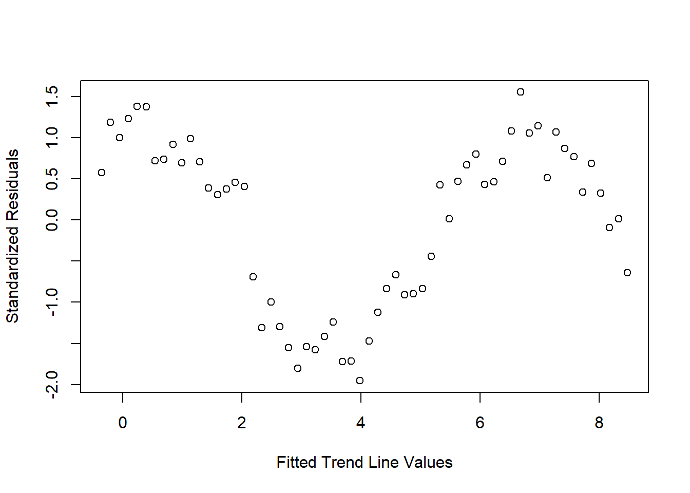
Sample Autocorrelation of Residuals from the Straight Line fit to the random walk
acf(rstudent(model1),
    main='ACF of Residuals from Straight Line Fit to Random Walk')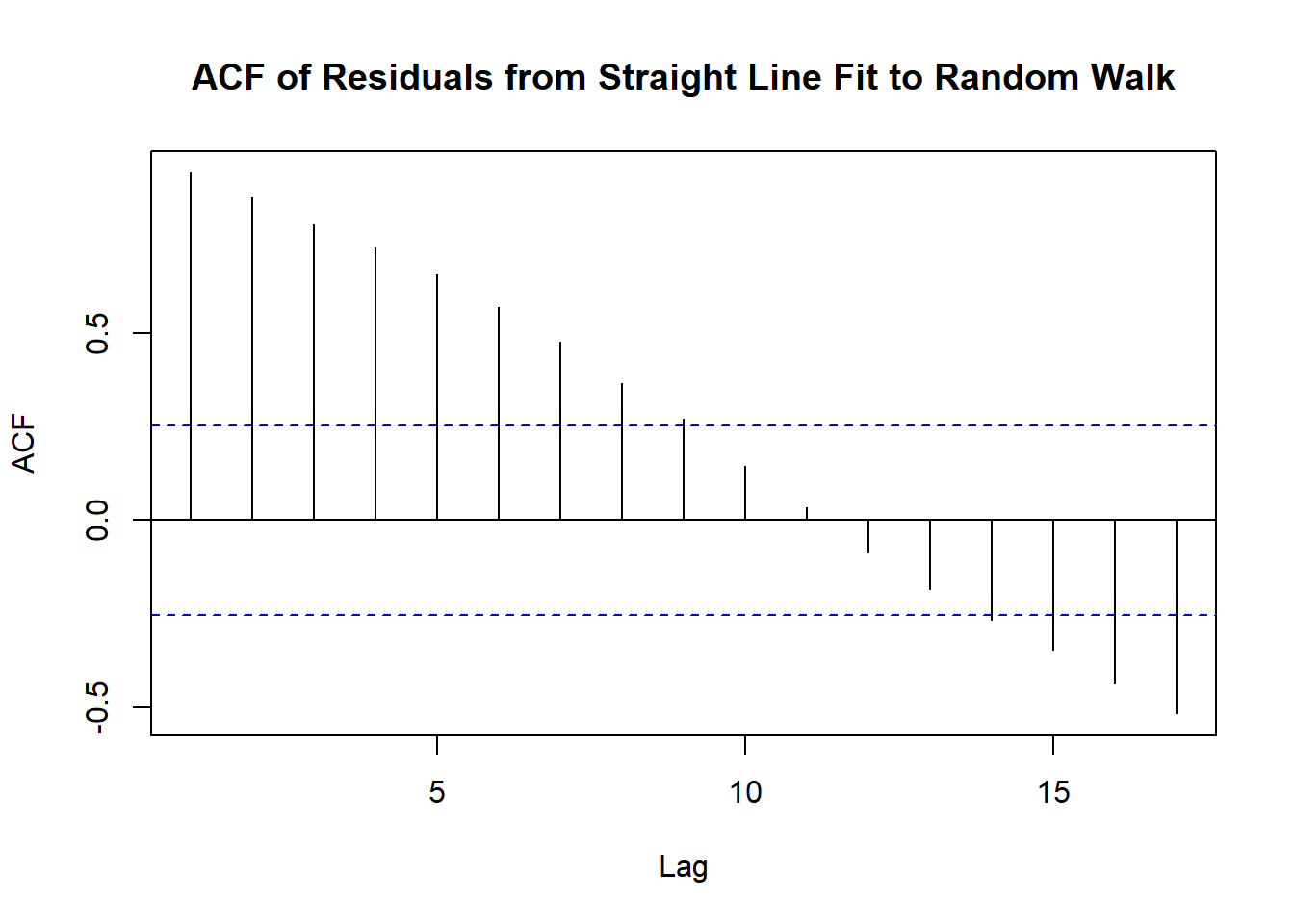
What if we try completely different approach to the random walk data. Let’s difference the data instead and plot the sample ACF of the differenced data?
\[ \nabla Y_t = Y_t-Y_{t-1} \]
acf(diff(rw),
    main='ACF of Differenced Random Walk')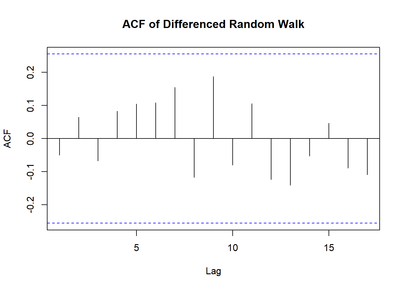
Turns out it’s an iid noise:
data("larain")
acf(larain,
    main='ACF of Los Angeles Annual Rainfall Series')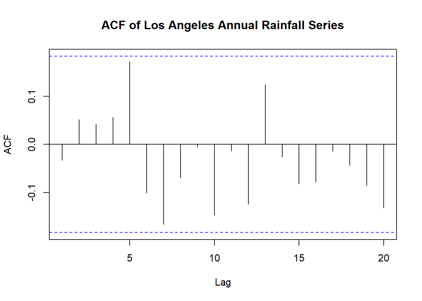
Is it normal? Let’s check the QQ-plot:
qqnorm(larain,
       main='QQ-plot of Los Angeles Annual Rainfall Series')
qqline(larain)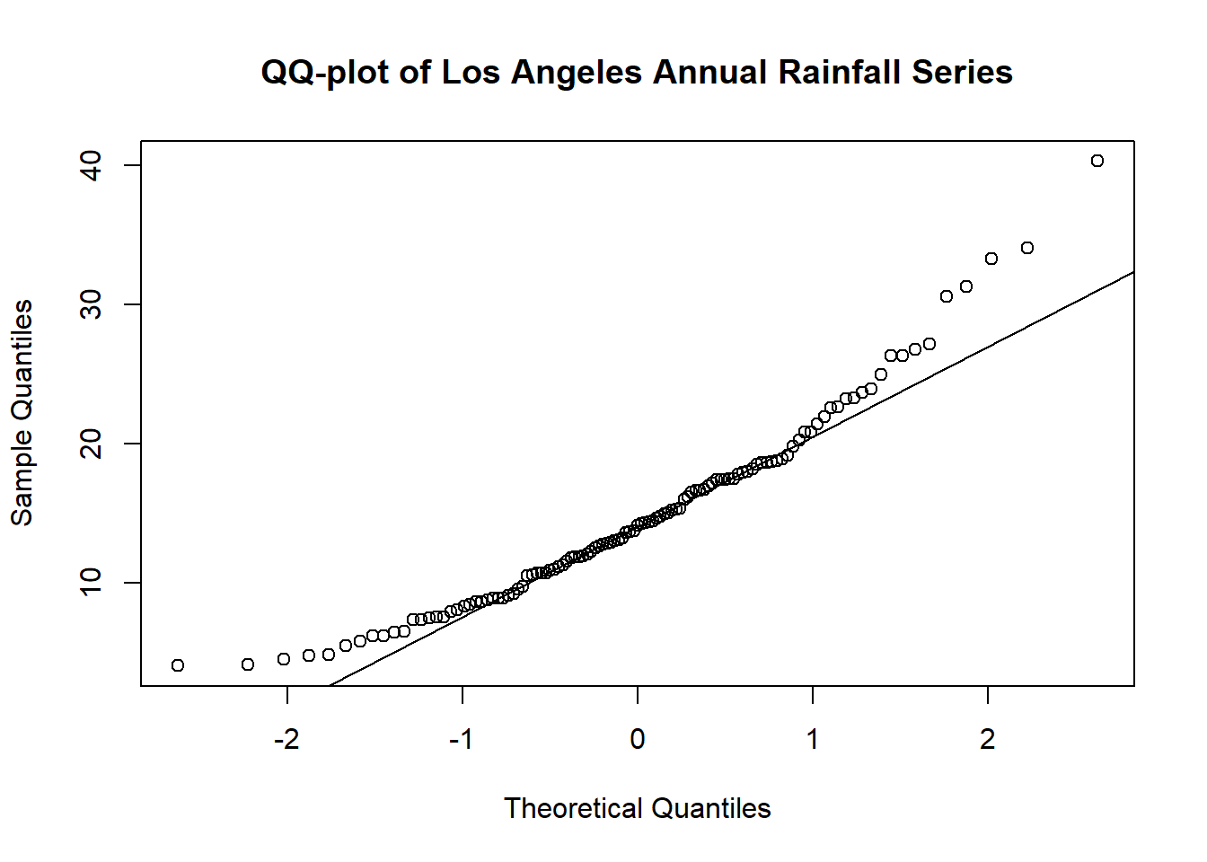
Q: is it left-skewed or right-skewed?
# Shapiro Wilk test
shapiro.test(larain)
    Shapiro-Wilk normality test

data:  larain
W = 0.94617, p-value = 0.0001614
If we log-transform the data, we can see that it becomes more symmetric:
qqnorm(log(larain),
       main='QQ-plot of log-transformed Los Angeles Annual Rainfall Series')
qqline(log(larain))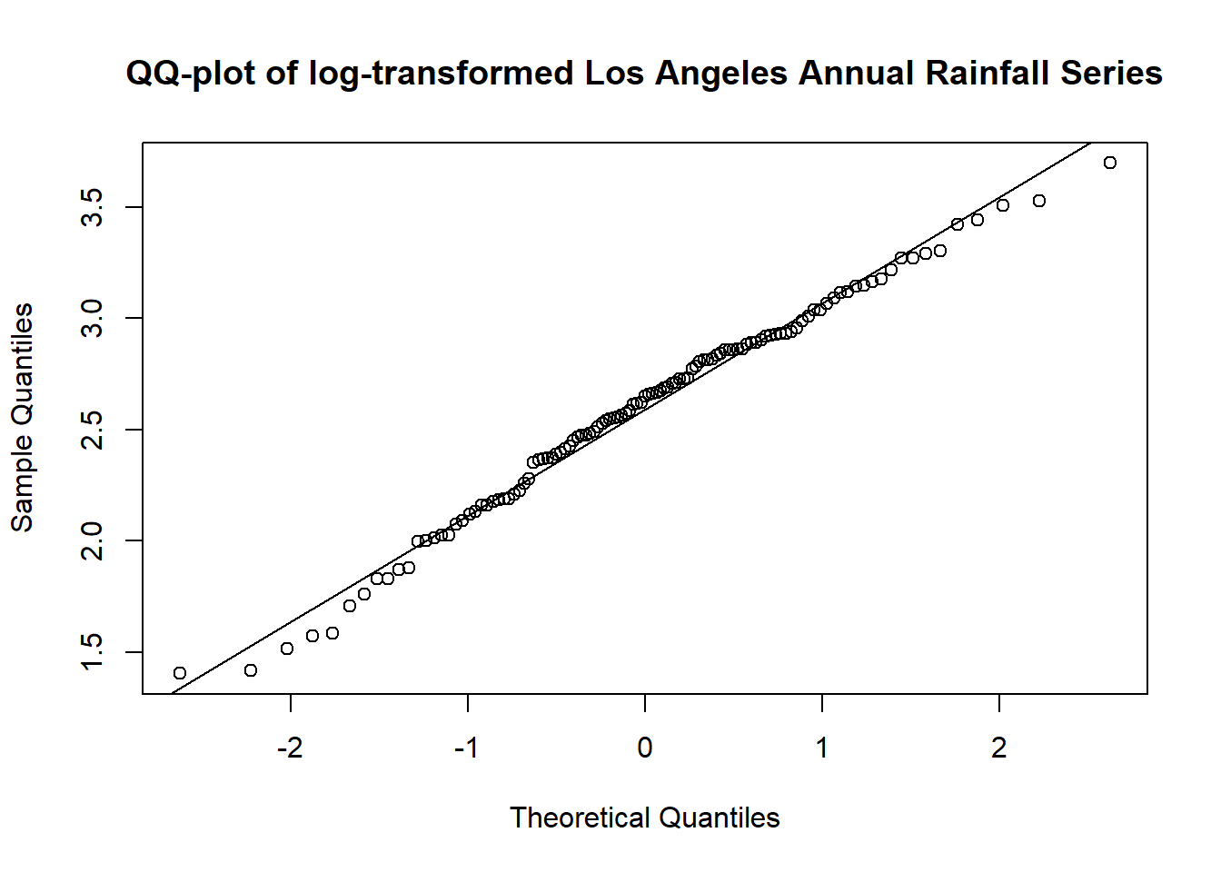
# Shapiro Wilk test
shapiro.test(log(larain))
    Shapiro-Wilk normality test

data:  log(larain)
W = 0.98742, p-value = 0.3643